
© norges-bank.no
The National Bank of Norway will be working around the clock. The citizens were assured that in 2017 the freshly designed krones will see the light. It is evident that the cash design has been already created, selected and approved. Generally saying, the most fun part is over. True, some of the portraits can truly cheer you up, especially the ones that did not perform good enough to reach the final competition.
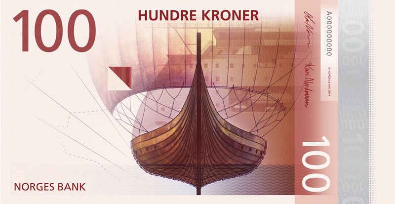
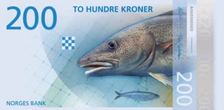
The competition for a new Krone design was announced last spring. I believe that recovering nature and the fresh artistic inspiration were the reasons why presented Krone designs were unique to that extent. Previously, whilst keeping a Krone, you could admire scientist Kristian Birkeland, opera singer Kirsten Flagstad and painter Edvard Munch. Now Norwegian Krone aims to reflect its major symbols, such as Viking ship, lighthouse and…fish.
© mojanorwegia.pl
The conditions applied for the participants aimed them to remain as close to horrific fish as possible. Its theme known to be „the sea“ (in Norwegian Sjø) obviously prompted that without fish in Krone design you can‘t be the winner. There were 8 finalists among whom the winner appeared to be the studio of graphic design named „The Metric System“ (the name comes from the head of banknote). It is possible, that the banknote flourished with fish was the reason that contributed to the team‘s victory. Of course, Viking ship and lighthouse as country‘s symbols helped to become winners as well. Don‘t forget that these symbols is the closest reflection of Norway and Norwegian Krone is where it has a chance to blossom at its best.
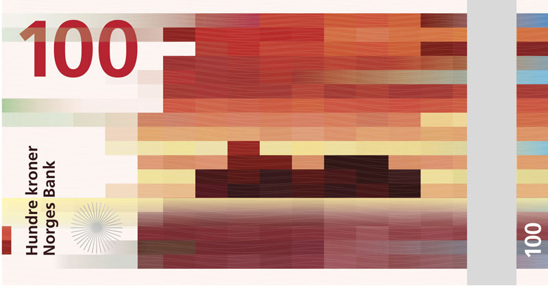
The reverse of the banknote compared to its head is a transit point from the traditional to modern art. The company focusing in the field of architecture was announced as the winner and is called „Snøhetta“. The team won due to unique idea. On the reverse of the banknote you could see pointillistic images. The points, squares and flat lines with dark shadows reflect the reverse painting of the banknote.
© norges-bank.no
The truth is that the first idea of National Bank of Norway was to announce one winner and keep cooperating with that team or individual. However, two original works reflecting Norway‘s past and present could not be separated from one another. These two periods of existence and ruling could not be separated as well. That‘s why the bank decided to work with both „The Metric System“ and „Snøhetta“ projects. Finally, it was promised to change the Krone design in the beginning of 2017.
I have seen so many different opinions upon it. Some Norwegians are happy with a unique and colourful look of the currency. While other even now start missing the old traditional Krone. However, all of them are annoyed by one question: „The presidents are no longer wanted to be reflected on local currency? Heh. First, we need to have them.
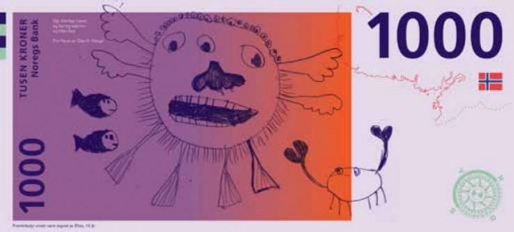
At the end, a fun question of, perhaps, the youngest participant of the competition, asking how the banknote of 1000 krone should look like. What would you say about such a sea monster?
© mojanorwegia.pl